Building a Scalable UX Research Repository
2024-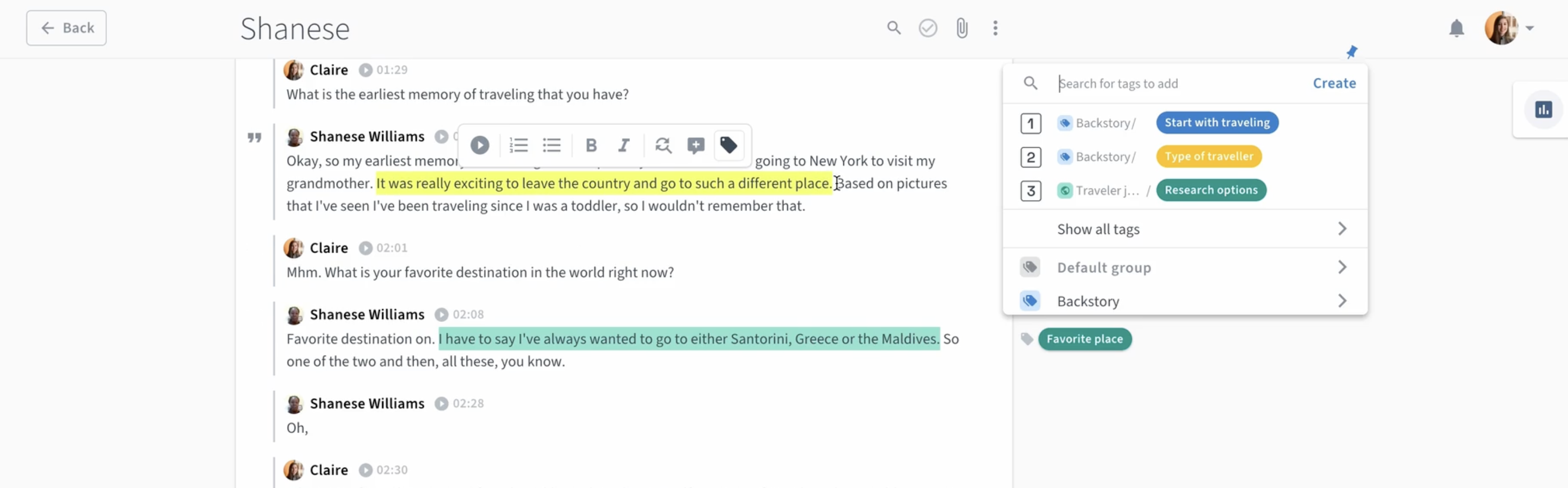
Overview
User research was scattered across multiple platforms, making insights difficult to access and leading to redundant efforts. With the departure of the only UX designer who had full research oversight, valuable knowledge risked being lost. To solve this, I led the implementation of a centralized, structured, and searchable research repository. This improved accessibility, stakeholder engagement, and research adoption, helping teams make more data-driven decisions. Through strategic tool selection, a scalable taxonomy, and transparent data practices, we successfully embedded research as a core part of product development and strengthened UX maturity across the organization.
Challenge
When I joined the company, I quickly realized that valuable user research was at risk of being lost or underutilized. The previous UX designer—who was the sole person with an overview of past research—was leaving, and with her, much of the institutional knowledge about what research had been conducted, what insights had been gathered, and where key artifacts were stored.
Without a centralized system, research findings were scattered across different formats and tools, as a result:
- Insights were siloed, making it difficult for designers, product managers, and developers to access past research.
- Teams often duplicated research efforts, wasting time and resources on problems that had already been explored.
- Historical context was missing, leading to design decisions that didn’t always build on prior learnings.
- New employees had no easy way to onboard into existing research, slowing down their ability to contribute effectively.
Process
Research & Discovery
To understand the challenges, I conducted stakeholder interviews to identify pain points. However, since research had low visibility, few team members had engaged with it in the past. Fortunately, I had strong support from a product manager invested in growing UX maturity.
I defined key tool selection criteria:
- Ease of use – Minimal onboarding required.
- Searchability – Insights should be easy to find.
- Shareability – Research should be accessible beyond the UX team.
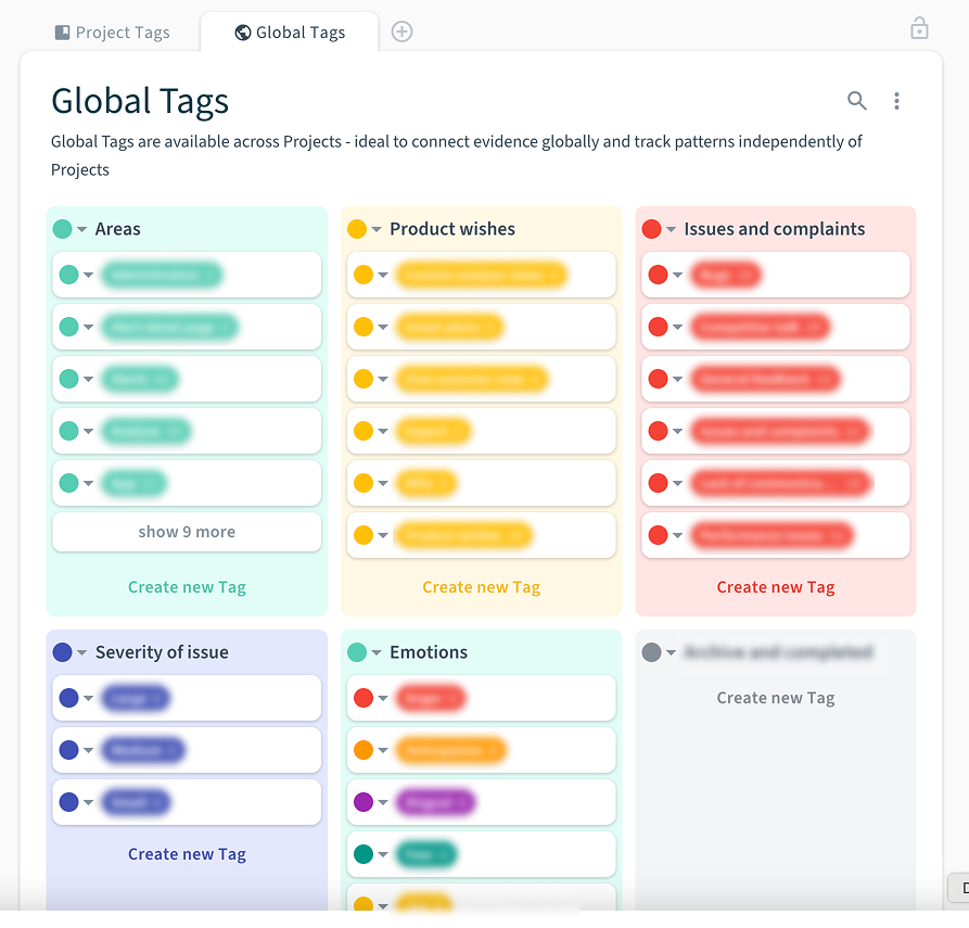
- Taxonomy & organization – A structured approach for long-term scalability.
I sent out an RFP (Request for Proposal) to relevant vendors, allowing for an informed decision based on facts rather than assumptions.
Solution & Implementation
After evaluating multiple tools, Condens was the best fit due to its repository-first approach, while competitors lacked focus on insight storage and accessibility.
To drive adoption, we prioritized visibility over formal training:
- Encouraged team members to create accounts and explore research independently.
- Integrated the repository into existing workflows to make insights part of daily work.
- Created structured research reports with direct user quotes and clips, sharing them across tools and meetings to increase impact.
Challenges & Iterations
Implementing Condens required addressing data privacy concerns. I collaborated with our data privacy lead and an external consultant to develop a GDPR-compliant permission form, allowing us to store interview recordings securely.
Additionally, taxonomy and tagging required continuous improvement. Regular UX team discussions helped refine our system, ensuring insights remained easy to search and connect across projects.
Outcome
Impact & Results
Without hard metrics, we relied on qualitative feedback, which was overwhelmingly positive:
- Less redundant research – Insights were easily accessible, reducing the need to re-interview users.
- Higher engagement – More team members, including management, took the time to watch full interviews.
- Stronger research adoption – Stakeholders found user quotes and video clips more relatable, making insights actionable.
The repository laid the foundation for stronger UX maturity, making research a central part of decision-making.
Key Learnings
- Adoption matters – Making research visible in workflows is more effective than training sessions.
- Taxonomy evolves – Tagging systems require continuous iteration to stay relevant.
- Engaging reports drive impact – Direct user quotes and video clips increase stakeholder buy-in.
- Data privacy must be proactive – Establishing clear guidelines early prevents compliance issues.
- A repository is a UX maturity milestone – This project helped embed research-driven decision-making into the organization.
- List items are a pain to add in html
Next Steps
To continue improving research adoption, we plan to:
- Expand stakeholder engagement by encouraging more teams to leverage research insights.
- Further refine taxonomy based on usage patterns.
- Track repository usage to measure impact and improve visibility.